

Typography
- Jan 26
- 5 min read
Updated: Feb 25
(Week 1)
For our introductory lesson in typography, we were provided many examples of typographic artwork with different styles and themes. I've had experience in working with typography in my previous college, but only the basics of its production, so learning about the historic value and intricacies of the artwork helped me understand why I really like typography as a concept: The art of show and tell blended together in a lovely collage of feelings, thoughts and virtues.
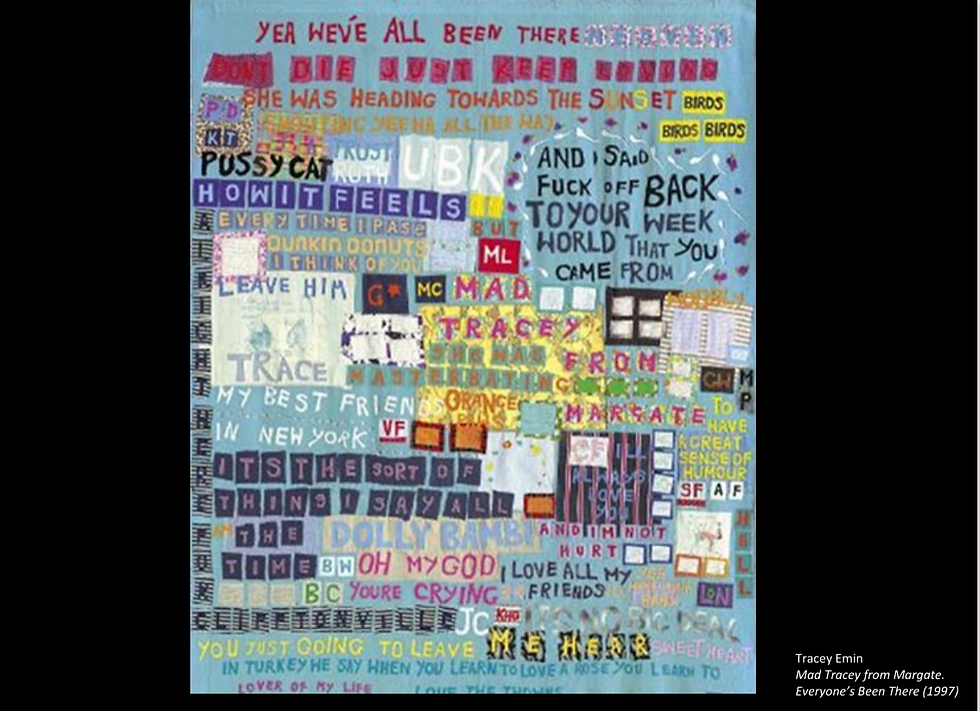
When it came to the works we looked at, one of the artists that grabbed my attention was Tracey Emin and their piece "Everyone's Been There" (1997) because of how it looks like a hundred stories from different people woven together in one piece. The multiple different fonts, colours and emotions for the collection of text sells the idea of individuality amidst chaos very well for me.

After our introduction to the art of Typography,the first assignment of the module was to assemble into separated, small groups and use the letters "Q","W","E","R" and "T" and mold and transform them into an object we have seen on the campus. The object my group had chosen was one of the faculty printers around the halls. My idea was to incorporate the CYMK colour print format of the printers into the letters by cutting out the letters from sheets of coloured card paper.

When sketching ideas for how out art could look, we spent a lot of time discussing how the letters should be designed round the printer. We first drew the basic shape for the printer from an angle so we could cram and morph the letters into its general shape. Afterwards, we made multiple sketches of the letters taking the printers form, we discussed which letters should go where until we decided on using the "Q" for the lid of the printer because it ressembled the lid the best. I wanted to use a bent paperclip as the "Y" that acted as the plug socket connecting from the wall, ut it was too small, so I opted for a paper cutout instead.


When putting our typography together, I initially planned on using a plain, white background to stick our letters on, but others in my group wanted to use a black background instead. I was against the idea at first because the letter "E" was already cutout to be coloured black and I didn't want it to blend in with the background, but after the piece came together, I'm really happy it was decided as the almost neon CYMK colours pop out really well. One of my partners wanted to nail down the letters with nails against a thick card surface and I personally preferred if we had used gluesticks instead as it was less of a hazard. I also felt the nails conflicted with the printer style, but I lso like the different medium applied to the art so I can't complain.


Despite the rush we experienced near the end of our assignment, we all pulled through and presented our work on the wall in time. Seeing everyone elses work was great as well as it helped give me inspiration for my future work. I'm looking forward to learning more about typography practices and bending the shape of letters to my will.
Songbook cover Designing - Week 2
For our next assignment, we were tasked with roaming around the campus and identifying shapes from objects and environments that could distinctivly or vaguely ressemble letters of the alphabet. We would then take photos of what we see and trace over them using tracing paper and pen, as well as other mediums.


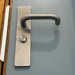


For my work, I wanted to stray away from many simple shapes in my enviornment, opting to instead take photos of objects and parts of the campus and buildings from specific angles. I love asymmetry in art, so forcing myself to really pay attention to which shapes make what letters was really fun. A door handly can be an "R" if you look from under it, or an L if you flip it upside down. An opened set of double-doors can look like a lowercase "N" if you break it down to its simplest components. There is so much oppurtunity for perspective with this work and I hope I can do it again.
After printing my photographs, I got to tracing and simplifying the shapes using black marker pen. I had a really fun time seeing how all of these different photos worked so well into twisted, organic shapes, but for the sake of consistency in size and theme, I opted to use the photo of the lift doors and interior to create a small sample of alphabet. I really like how they looked because the sharp, clean style really reminded me of the cold, steel interior of the lift.
To get a better understanding of how effectively typography is used commercially, we were then tasked with creating a songbook cover using only photocopied text given to us. The text would be made up of information of the potential songbook's title, genre, publication year and publishing company. The way we would design our songbook covers was determined by the genre of music the songbook contained. My choice of genre was "Rock n' Roll", but like most people in the class, I had misunderstood the point that we were supposed to use only the limited resources given to us, so I ended up using coloured paper as a background and to cut out the bold text.
While I may have drifted fom the original point of the task, I did enjoy measuring the size of the typeface and multiplying it to an even bigger size. I admit I was very embarassed by how much I had missed the point of the task as I was confused but didn't ask for clarification out of embarassment. I'm also used to wrking within restrictions and creative limitations, but a major reason to why I deviated was because I felt I wouldn't have been happy with the results of my work.


despite my major hiccup from
Week 3
Letter Printing and Leaflet Designing - Week 4
Today's class was dedicated to the history of letter pressing and putting the practice into my work.
For my work, I really, really like merging letters together to create an image for


For my first draft, I wanted to create a cover that felt consistent in its chaos so it could catch someone's eye, whilst still being presentable enough for a stranger to look at. My mentality when creating most abstract artwork is to catch someone's attention using a chaotic, almost messy composition, that way anyone looking at it would automatially be pulled in to look at the finer details. In this case, the details would be the repeated use of the word "SHINE". When presenting my work to my tutor, the main point of criticism was that it was "too loud/messy", which is completely understandable. I have always favoured messy art over clean art primarily because I enjoyed the process of making a mess a lot more. Despite my bump, I retried and cleaned up my work a lot better.

For my second draft, I believe I was a lot more successful in presenting something eyecatching without it nbeing visually overstimulating. I aimed to clean up the composition by being more cautious about which pieces I would use and where I would place them without using too many repeating elements. I also used much simpler shapes as opposed to irregular, chaotic shapes plastered all throughout the page.
Once my work catches the eye of a stranger, they'll flip the leaflet around, revealing the address and sign-up informtion gor the letter-press workshop.

Week 5


Comments